CenterPoint® Accounting for Agriculture
- Using Maps in Production Analysis (WIP)
Related Help
_24.jpg) Create Production Center Maps Video - Duration: 9 min 40 sec
Create Production Center Maps Video - Duration: 9 min 40 sec
Create Production Center Detail Maps Video - Duration: 5 min 34 sec
Working with Production Analysis Maps Video - Duration: 8 min 45 sec
Printing Production Analysis Maps Video - Duration: 3 min 0 sec
MyJohnDeere Authorization Video - Duration: 2 min 42 sec

| Document #: | 3369 | Product: | CenterPoint® Accounting for Agriculture |
|---|
Production Analysis provides a visual comparison of your production detail using the geo-spatial maps stored in your production centers and production center details. Maps are available when analyzing by Production Center Detail or Production Centers. A map needs to be defined in the setup of each production center detail or production center included in the analysis. The maps are compared using the analysis details which will be called attributes when working with maps. Here are just a few examples of endless ways to use production analysis maps:
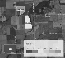
- All production details that grew a specific crop colored with a yield legend and yield label. The color variations give a visual comparison of yields as well as displaying the value.
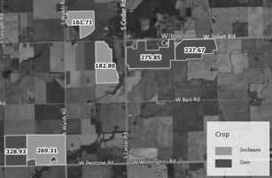
- All fields with a crop (profit center) legend and a label of net $/Acre. Each crop will be represented with a different color to view all fields by crop. Each field includes a label of net profit per acre.
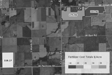
- All production details with a fertilizer cost / acre legend and a label of yield per acre.
- In this example the colors demonstrate the variance of fertilizer costs applied and a label indicates its productivity.
- If the production center details represent subscribed input variances, your field may have multiple production center details for one crop grown in one field. The result is a much more accurate picture of input costs to output production.
- All livestock locations with feed costs / per head.
This document includes the following topics:
Using Maps in Production Analysis (WIP)
- Under Reporting Tools > Production Analysis > Analysis (WIP), select File > Open.
- Select a production center detail analysis or a production center analysis. Click OK.
- Select the Map menu option.
-
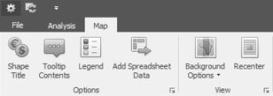
The toolbar ribbon can be collapsed to provide more map area by clicking the arrow at the far right of the toolbar ribbon. Clicking the arrow again expands the toolbar.
-
The toolbar ribbon can be hidden. Right-click and select Minimize the Ribbon. To display the toolbar ribbon again, select the Map menu and right-click to unselect Minimize the Ribbon.
- Maps defined in the production center details or production centers that were selected in this analysis display on the screen.
- Use the mouse wheel to zoom in and out on the map.
- Maps can be imported from sources such as Shape Files, Controller Data Files, or My John Deere. Maps also include drawing tools to add maps to your production details.
- Maps are stored in Setup > Profit/Production Centers > Production Centers or Setup > Profit/Production Centers > Crop Production Center Details or Livestock Production Center Details. For additional information, please refer the Understanding and Using Maps topic.
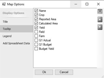
- In the Options icons are selections to set the attributes you wish to use as a map label, attributes included in each map’s tooltip content, the details assigned in the legend, and the ability to add other attributes.
- Shape Title selects the attribute you see on each map label. For example, selecting Yield displays the calculated yield per acre accessed from crop production center details (Actual Production / Acres). Or selecting Field displays the production center name.
- Tooltip Contents select which attributes you wish to include in the tooltip and the order in which they display. Tooltips display when you hover over a map with your mouse. Select the attributes you wish to include. Use the up and down green arrows to order the attributes as needed.
- Legend defines the attribute, color, and placement of the map legend.
- Legend Attribute selects the detail used to generate the legend. A list of attributes is included.
- For example, select Yield if you want the legend to represent the yield per acre of each field.
- If you want the legend to represent number of acres, select Calculated Area (acres calculated in the map boundaries) or Reported Area (acres entered in the production center detail).
- Additional attributes can be added using Add Spreadsheet Data. For example, adding Fertilizer Cost Totals row with $/Acre column includes Fertilizer Cost Totals $/Acre in the list of attributes.
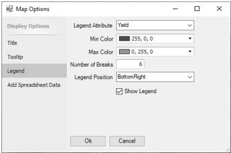
- Min Color sets the beginning color used in the legend. Any color can be selected. Click the drop-down arrow to display a color palette for your selection.
- Max Color sets the ending color used in the legend. Any color can be selected. Click the drop-down arrow to display a color palette for your selection.
- Number of Breaks define the number of divisions in your legend. Enter the number of divisions. The beginning and ending values in the legend are based on the values gathered from the analysis for the selected legend attribute.
- Legend Position determines where the legend is displayed in the map area.
- Select Show Legend to display the legend or unselect to hide the legend.
- Add Spreadsheet Data selects from all the rows and columns included in the analysis spreadsheet that you wish to access as an attribute for the map titles or legend.
- Spreadsheet Rows display all rows available in the spreadsheet beginning with performance measures and followed by the account types included in the analysis.
- All transaction data columns and performance measure columns in the analysis spreadsheet display as columns in the spreadsheet.
- In rows, each account type section at the left can be expanded to access individual account rows, account category total rows, or account type total rows.
- Clicking in an empty cell within the grid drops down the rows available in that section.
- In a row you wish to add as an attribute, select the column you wish to include. Rows with check boxes indicate the row can be used as an attribute.
- For example, if you wanted to map Fertilizer Cost Total $/Acre, check the box in row Cost of Goods > Fertilizer Cost > Fertilizer Cost Totals in column $/Acre.
- Another example, if you want to map Labor Expense Total Hours, check the box in row Expense > Labor Expense > Labor Expense Totals in column Quantity 1.
- Selecting a column in the Spreadsheet Rows adds that detail to the list of attributes.
- An attribute can be selected as a Shape Title, a tooltip, or a Legend Attribute.
- Add as many attributes as you wish.
- In the View icons:
- Recenter returns the zoom focus to center the production centers or production center details included in the analysis. If you are using your mouse to move around in the map, Recenter returns to the original focus.
- Background Options drop-down menu includes Aerial, Roads, or Hybrid.
- Aerial is an aerial view with no road definitions.
- Roads include labeled roads and locations without an aerial view.
- Hybrid combines both the aerial view and road names.
- The icon toolbar can be collapsed to provide more map area by clicking the arrow at the far right of the icon toolbar. Clicking the arrow again expands the toolbar.
- The arrows at the upper left toggle between Show Quick Access Toolbar Above Ribbon or Show Quick Access Toolbar Below Ribbon as a preference.
Printing / Exporting Production Analysis Maps
Production Analysis Maps are printed, previewed, or exported from the Production Analysis File menu. The production analysis currently open can print, preview, or export maps in that analysis.
- To print, select File > Print Map.
- A Print dialog box displays.
- Select the printer.
- Select the Print button.
- Preview Map allows adding headers or footers to the printout, scaling the size of maps, as well as other features. To preview, select File > Preview Map.
- A map preview displays.
- The preview screen toolbar includes functions to modify your printed map.
- Header/Footer provides an input of a header title or footer note. Click OK to accept.
- Scale allows enlarging or decreasing the size of the map by a percentage of normal or a Fit to page.
- Margins adjusts the page border margins.
- Orientation allows portrait or landscape.
- Size selects a paper size.
- Maps can be printed or exported from the preview screen and will include preview modifications.
- Click the Print icon to print. A print dialog box displays to select the printer and other optional number of copies or page range. Click Print.
- Click the Export down arrow to select if you wish to export to a folder location or email the file.
- Selecting Export To displays a drop-down of format options. Select the format. The next screen allows optional modifications for the selected format. Click OK to select where you wish to save the file. Enter a file name. Click Save.
- Selecting Email As displays a drop- down of format options. Select the format. The next screen allows optional modifications for the selected format. Click OK to select where you wish to save the file. Enter a file name. Click OK to display a Send Email screen with the file attached. Fill in the email address you wish to send the map and enter a message.
- Select Close to close the preview screen.
- File > Export Map to PDF displays a File Explorer screen to select where you wish to save the PDF file. Select a folder location. The file name can be changed if needed. Click OK
|
Document: 3369 |
|---|